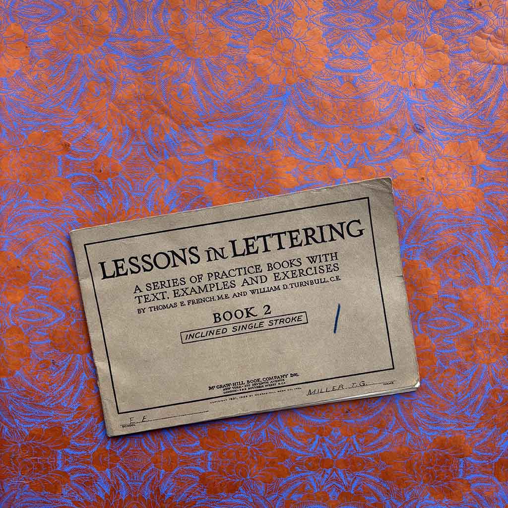
Lessons in Lettering
The 1924 manual, Lessons in Lettering, is a specialized lettering course for architects.
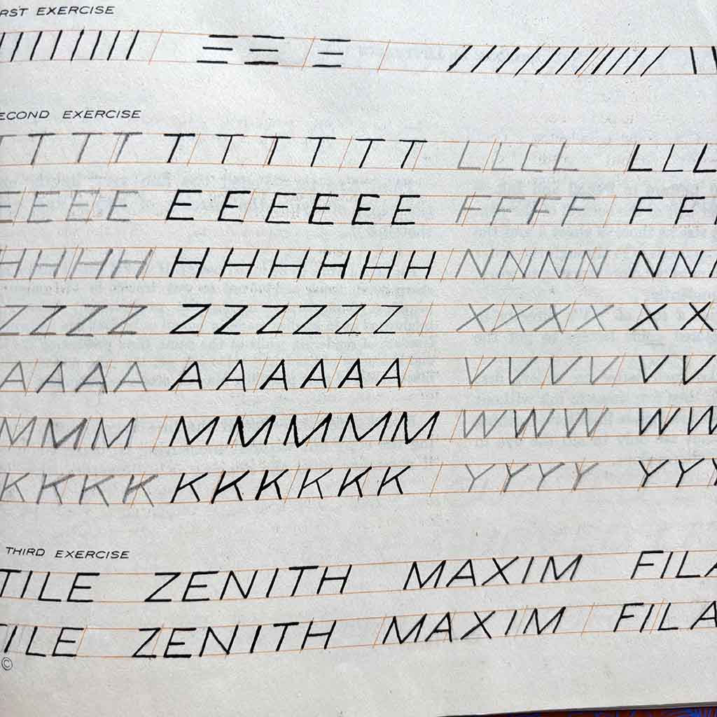
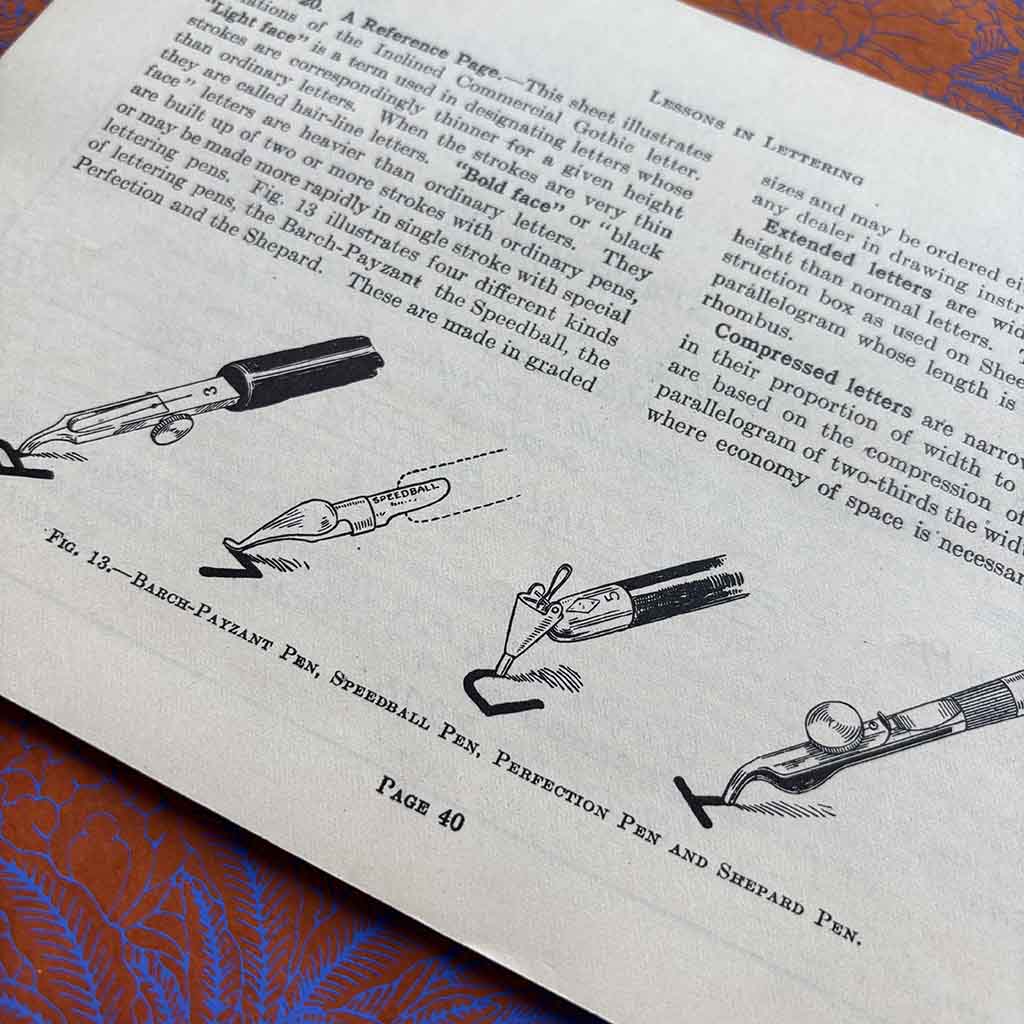
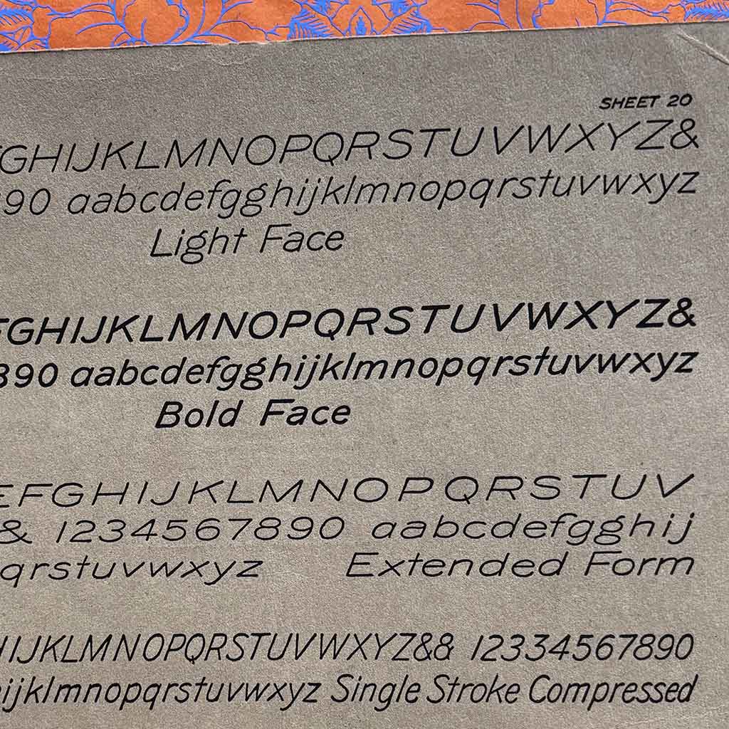
Much like the penmanship copybooks that I collect, these manuals offer a peek into the minds of aspiring architects. The book explains how to create the perfect slanting text used in architectural drawings. It expounds upon ink and pen choices and includes examples of writing instruments that I have never encountered before. And, of course, there is space for penmanship practice.
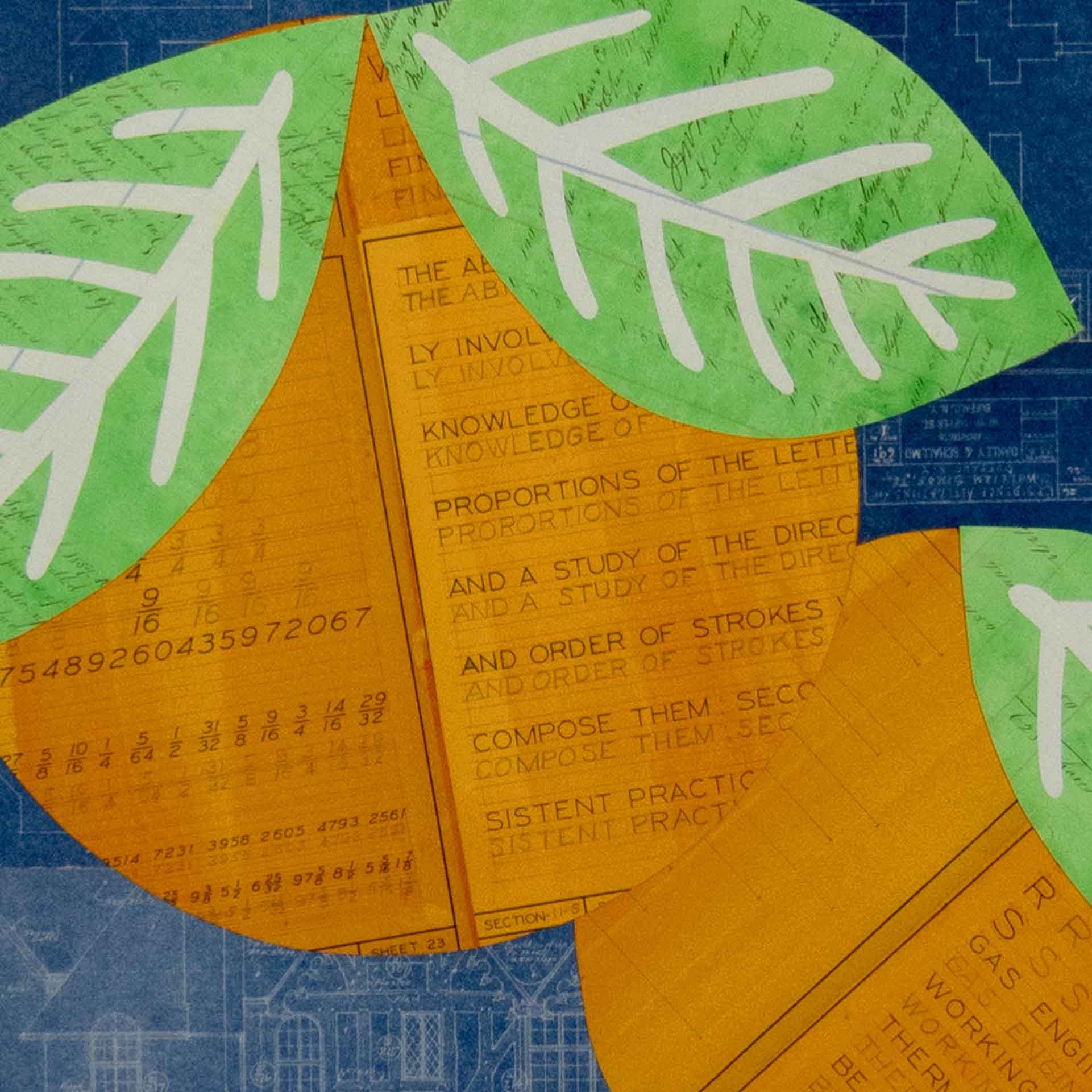
I used pages from a similar instructional manual in my collage, Oranges No. 6. because I am very interested in watching students learn and grow over time. The pages are filled with repeated exercises in proportion and spacing, the steady work of learning precision by hand. One misspelled word appears among the drills. I noticed it immediately and chose to leave it in. Mistakes happen.
What moves me most about Lessons in Lettering is not the perfection it strives toward, but the evidence of effort it preserves. These pages were never meant to be precious; they were tools, working documents designed to be used up and discarded once mastery was achieved. And yet they endure. The careful slant of each letter, the diagrams of nibs and inks, the patient repetition of line after line all speak to a moment when architecture began not with a building, but with a hand.
In salvaging and recontextualizing pages like these, I am less interested in nostalgia than in continuity. The manual becomes a record of learning, of discipline, of human error and intention. The misspelled word, left intact, feels like a small act of honesty across a century. It reminds me that behind every blueprint, every structure, every finished work, there was once a student practicing their lines on paper.